Distinctive Schools Visual Identity
Distinctive Schools, a non-profit committed to advancing charter schools in underserved communities, encountered the challenge of standing out in a saturated market. They wanted branding that reflected the same energy their students and teachers feel while staying cohesive and on message across their schools.
The Problem: Distinctive needed brand support to help them stand out from the crowd.
The Solution: Refresh their brand elements, provide clear guidelines and create templates for Distinctive to use across social.
Services: Brand Identity Refresh / Chicago Transit Campaign
Work done on behalf of BatesMeron Sweet Design.
Art Direction & Design: Esmeralda Hopwood Copywriting: Lili Kryzanek


Multiple Audiences
The most significant challenge our team pinpointed was Distinctive Schools’ lack of a cohesive communication strategy for its three primary audiences. Our solution involved creating a fresh, inclusive brand presence that would empower all audiences—regardless of the topic at hand.
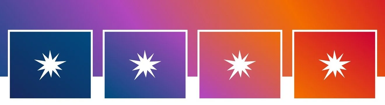
Building around Existing Brand Elements
Brand elements that were already being utilized by Distinctive Schools served as the inspiration for design and copy explorations. We recognized the strongest elements of the existing brand and infused them into a new creative identity in fresh and unexpected ways—starting with the color palette.


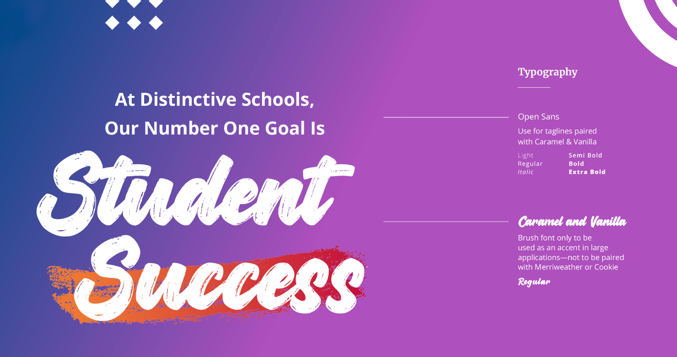
typography that’s flexible
As an already established school, Distinctive was keen on having typographic options that could be used by administrators, teachers and students alike. Keeping this in mind, we opted to use google fonts Merriweather and Open Sans to keep things professional but approachable. Never forgetting the fun elements of the brand, we paired these fonts with the scripts Cookie and Caramel & Vanilla. The variety of fonts gave Distinctive the flexibility they wanted while still maintaining they strove for.

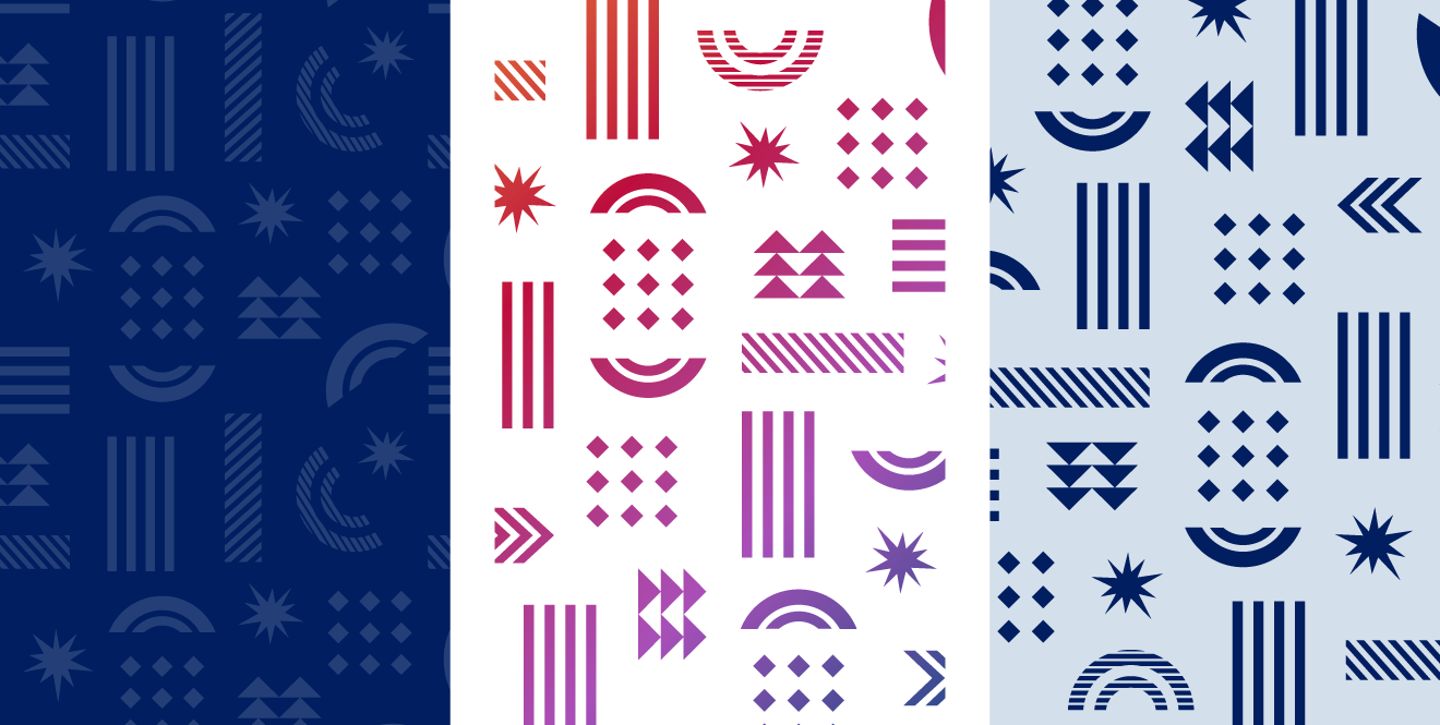
Fun with Patterns
To help draw audience focus and further elevate the brand in unexpected ways, shapes that gave a sense of depth and movement were incorporated into designs. These dynamic shapes would be mixed and matched to create patterns that would be utilized as accents on photography, text-heavy presentation slides and more.

Custom Illustration
In addition to the pattern elements, I created an illustration style to use in larger applications. This style, known as the ‘wave’ pulled aspects from the official pattern and combined it with abstract wave illustrations that circle a subject. This style of illustration continues to push forward a brand made for the students that attend the schools.


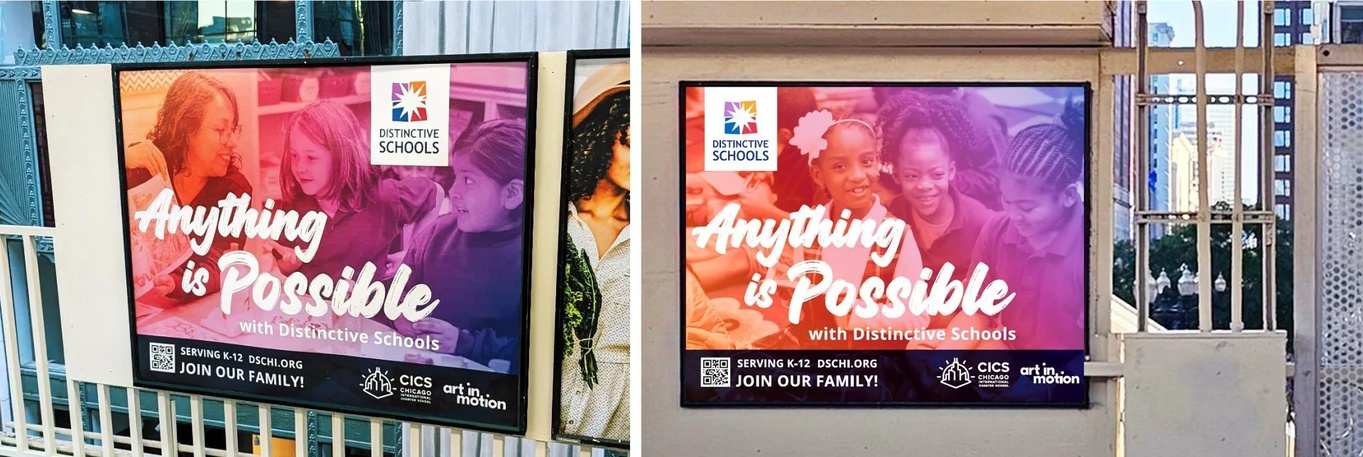
Getting the Word Out on the CTA
We were asked to bring a theme to life for Distinctive Schools’ annual Chicago Transit Authority initiative that would embody their newly revitalized brand and attract attention from families and educators in a uniquely refreshing manner. This challenge was particularly daunting against the backdrop of a city saturated in marketing. We set to work and crafted three unique themes for Distinctive to consider.

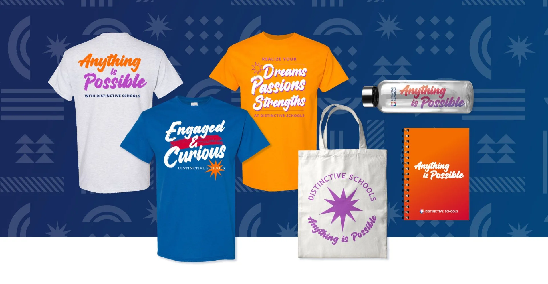
Anything is Possible
Although all three concepts received praise, Anything is Possible was chosen. This theme focused on the future of students at Distinctive Schools, where indeed Anything is Possible. Photography paired with gradient overlays made the perfect backdrop for the campaign’s main headline in an all white brush script. With creative locked in, we saw the campaign come to life across Chicago Transit including bus stop ads, train station ads and on bus backs.