Deep Dish Carton RedesigN
Services: Art Direction / Package Design
In 2019 the Gino’s East Frozen Pizzas cartons underwent a major redesign. Three years later, I was again approached to tackle updating the package design based on updated customer interaction.
The Problem: Gino’s East wanted to focus on a natural looking box with a greater emphasis on color than the previous boxes.
The Solution: An updated box with a natural carton look, bold typography that more closely aligned with Gino’s East as a brand, and an emphasis on the Gino’s East story.
Gino’s East Deep Dish Cartons
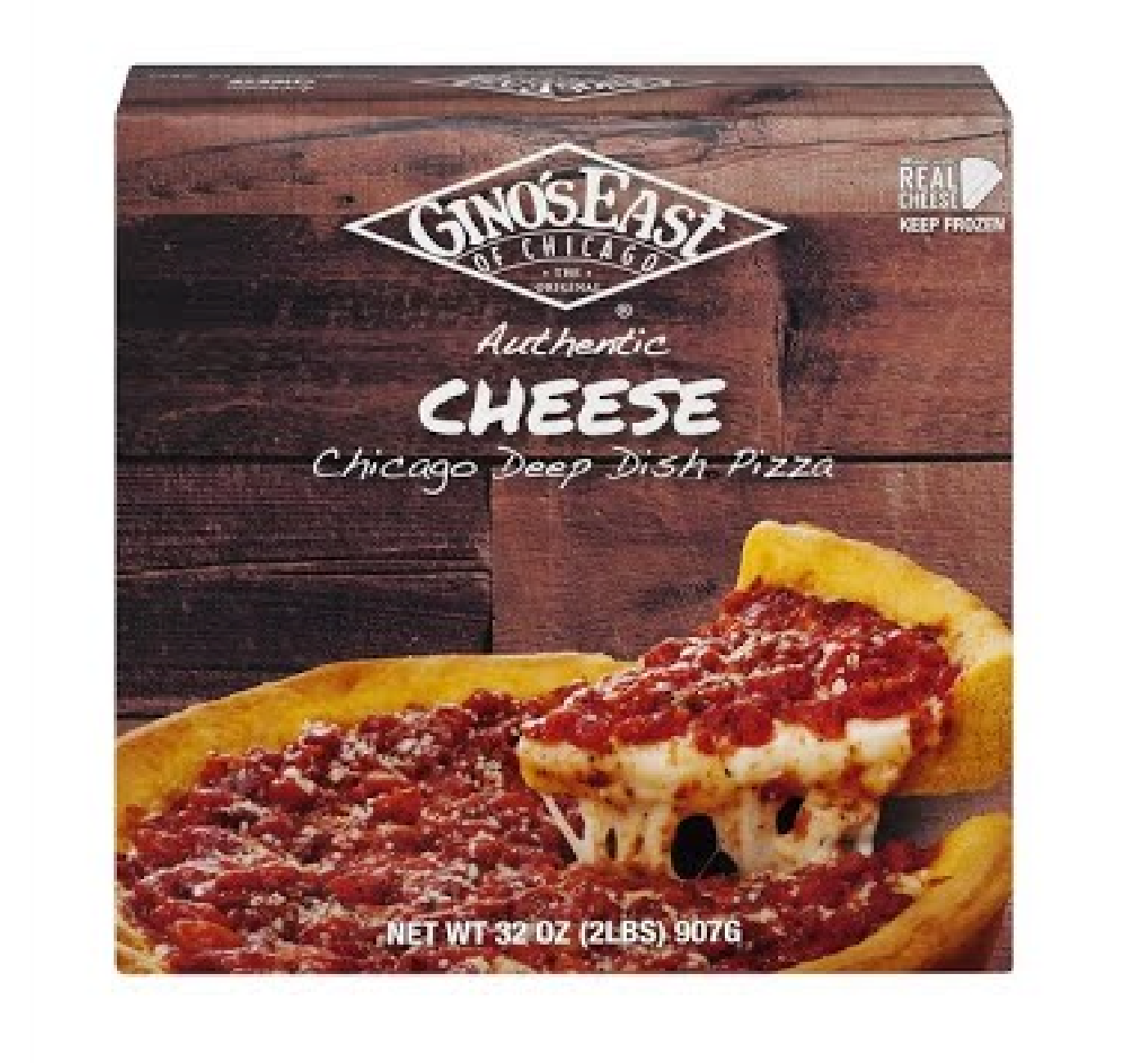
Original Packaging 2017
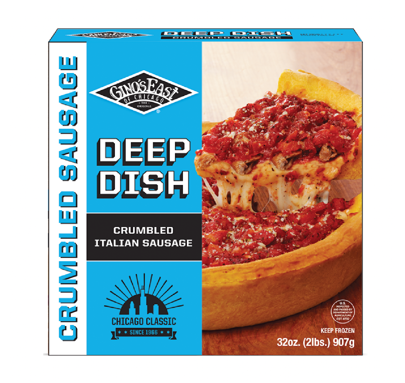
Gino’s East Deep Dish Cartons
Updated Packaging 2019
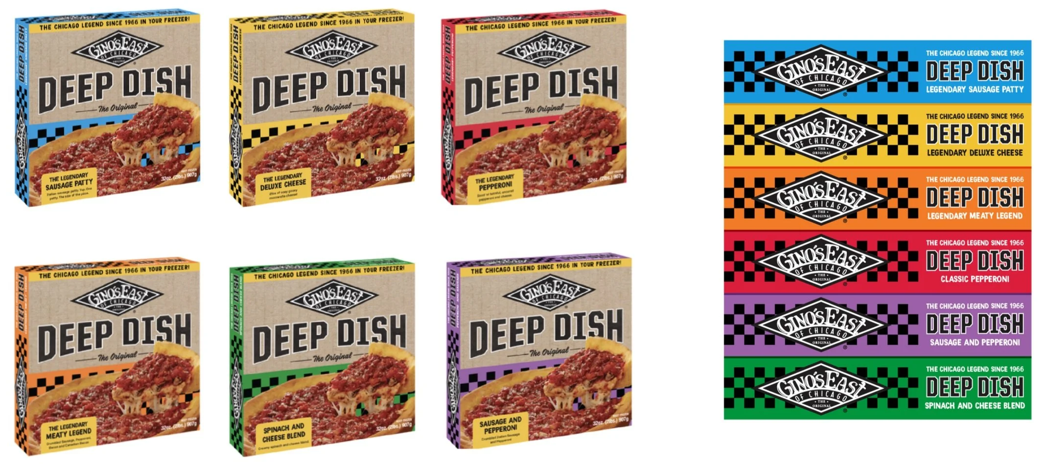
The 2019 update to the Deep Dish cartons focused on bold simplification by using a color blocking system to help with customer self selection. Each flavor of pizza was assigned its own unique color which would help customers automatically locate the one they wanted. The updated design saw a surge in flavor selection that allowed the brand to expand into more freezer sections. This also paved the way for updated Tavern Style cartons and the inclusion of more flavors.
New concepts for 2024
After 4 years, Gino’s East conducted in depth analysis and found that there was room for improvement. Research showed customers responded to bold colors, but the size of the cartons, and the way they were stacked in the freezer section, made it difficult to find.
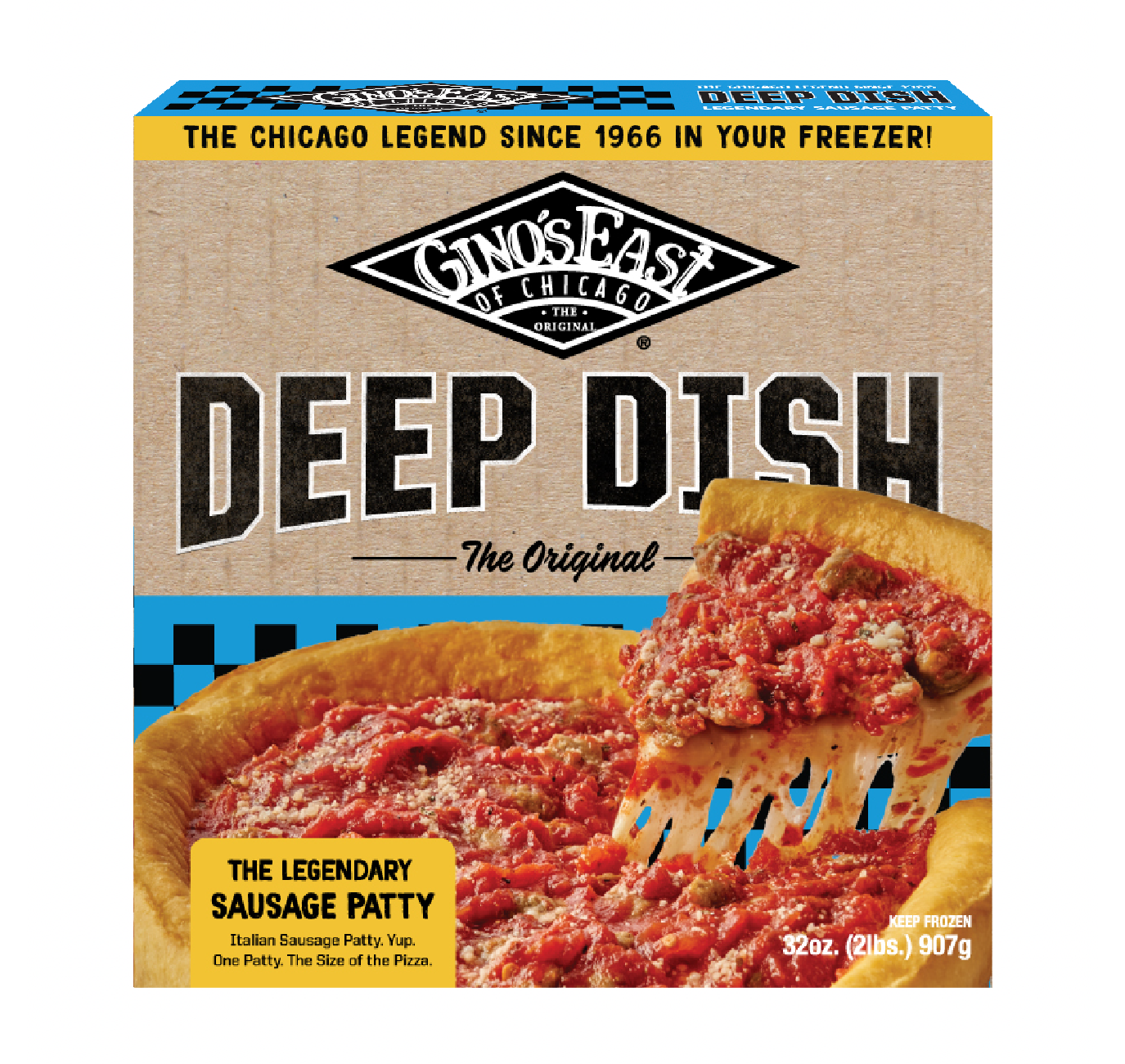
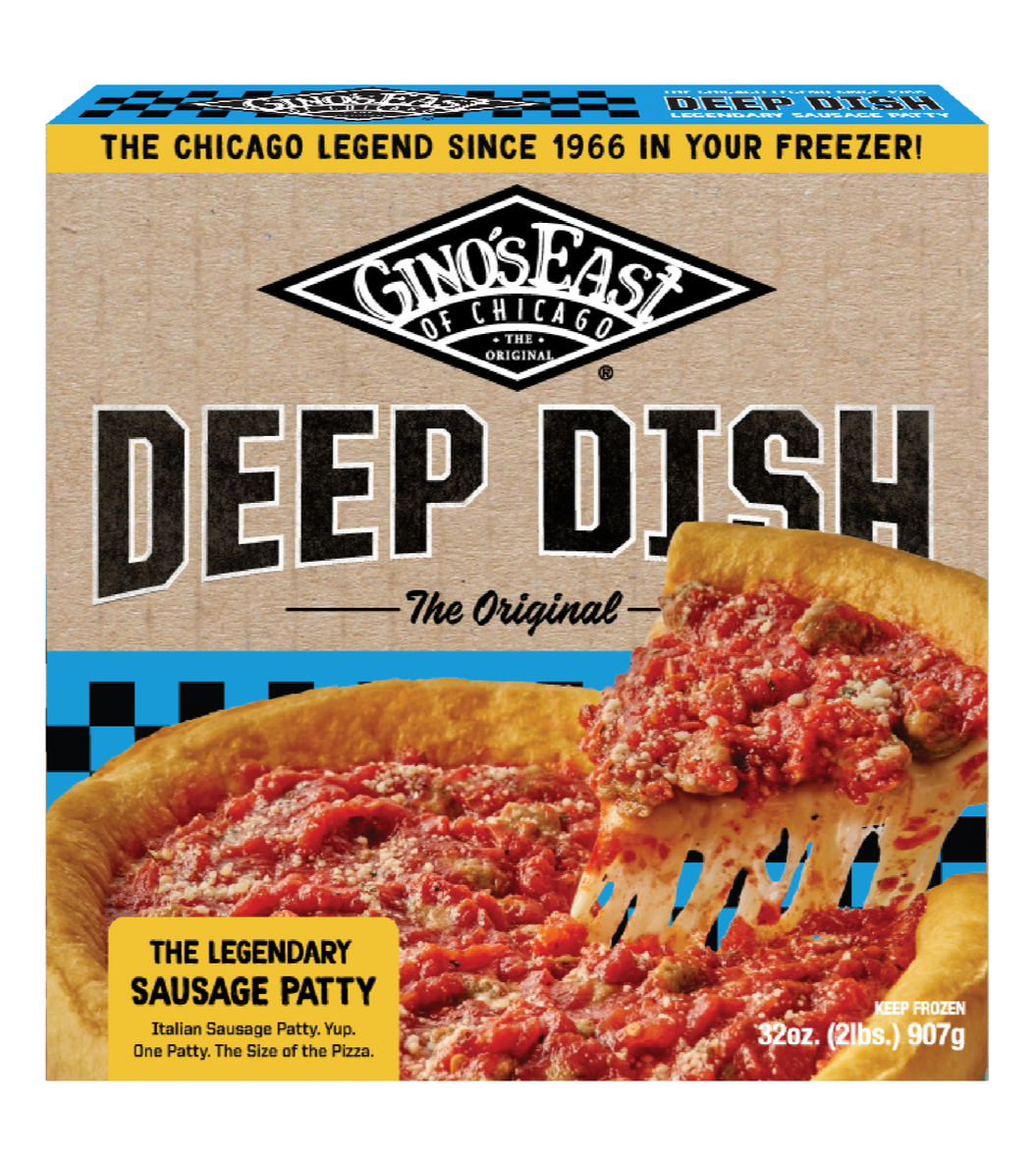
Concept one utilized the texture of cardboard paired with the same bold colors consumers had grown accustomed to. Simplified typography, larger than life logo placement and pops of color, this concept freshened the look without losing the color coded nature of the 2019 cartons.
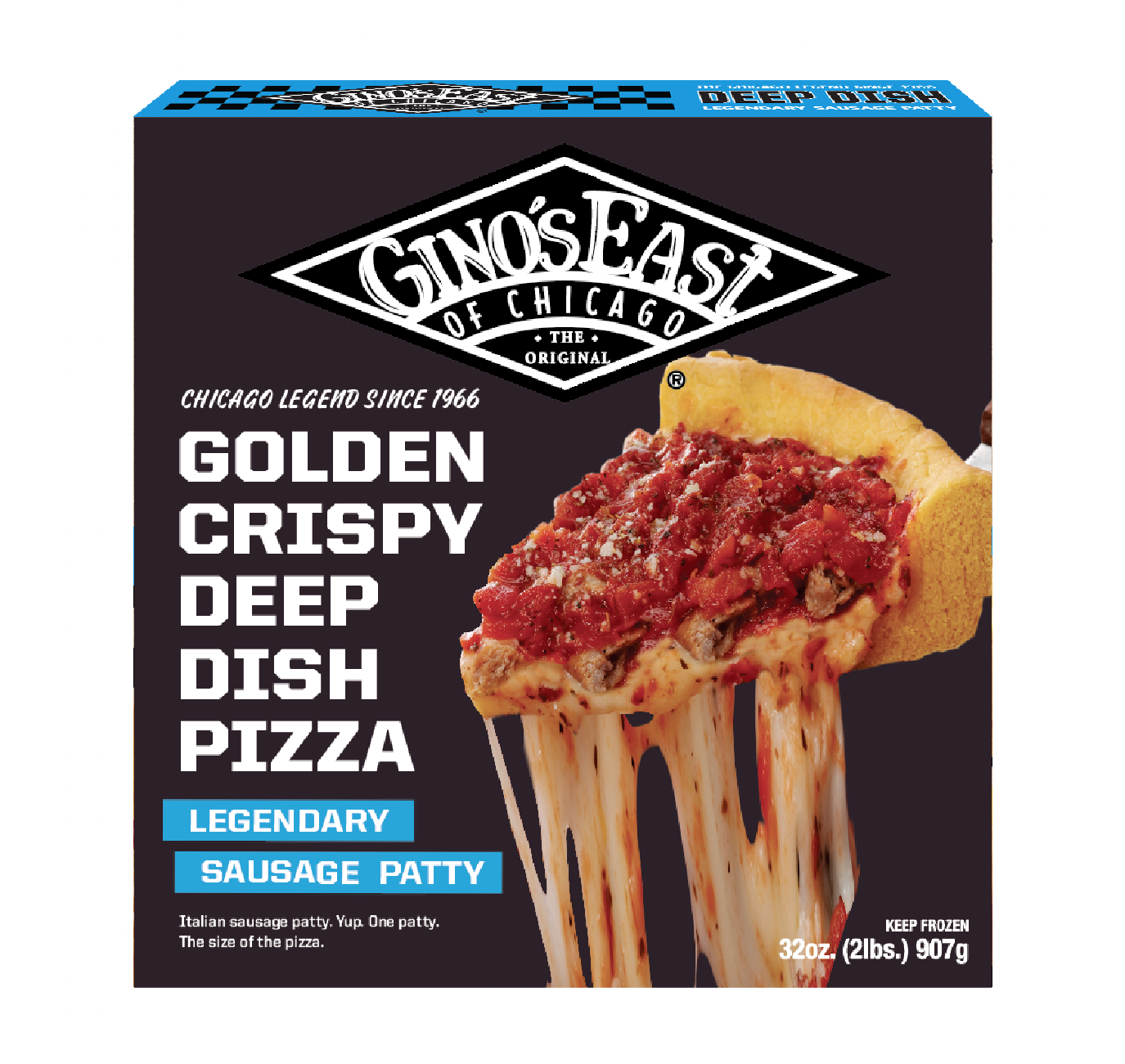
Concept two took a different approach with a dark background and a focus on the legendary cheese pull. Large and crisp typography describes exactly why you should buy this deep dish and forget about the rest.
After much back and forth, the Gino’s team agreed: concept one would have broader mass appeal while still standing out from the rows and rows of competitor pizzas.
Cardboard?
Studies have shown that consumers interested in small-batch, hand-crafted items, choose natural cardboard materials over glossy boxes.
Knowing this, I focused on using a natural cardboard box texture in order to mimic the cardboard boxes the restaurant pizzas came in.

Don’t Forget Your Roots
Gino’s East was started by two taxi cab drivers and a dream of pizza on the Magnificent Mile. I brought back the checkered background with the Gino’s East iconic logo in order to remind customers; Gino’s East is slinging the same pizzas they were back in 1966.
Based off the research Gino’s conducted, it was determined that the sides of the boxes needed to be eye catching to mitigate how grocery stores stacked boxes in the freezer. Bringing the checkered logo to the side and laying it over a flood of color ensured we had the brightest and most visually striking box in the aisle.
We’re in the oven
The new and improved Deep Dish cartons hit shelves in early 2025 across the Chicago land area. Consumer reception has been very positive and the Gino’s East team has reported an increase in restocking by grocery stores like Jewel Osco and Aldi. If you’re in the Chicago area, swing by the freezer aisle and grab a pie for yourself!
Love the Packaging work?
Make sure to check out the other projects I worked on for Gino’s East!