Gotham Bagels Brand Identity
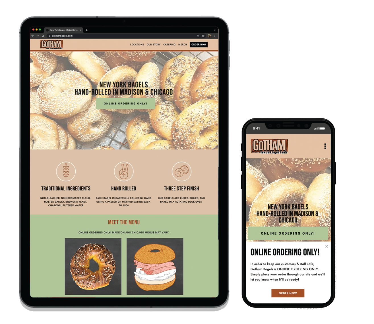
Gotham Bagels, the best bagels in the midwest, wanted to refresh their brand identity ahead of their expansion to Chicago. The identity refresh included the creation of a secondary logo, a new website, icon design, merch design and more.

Existing Logo
A blurb goes here

Secondary Logo
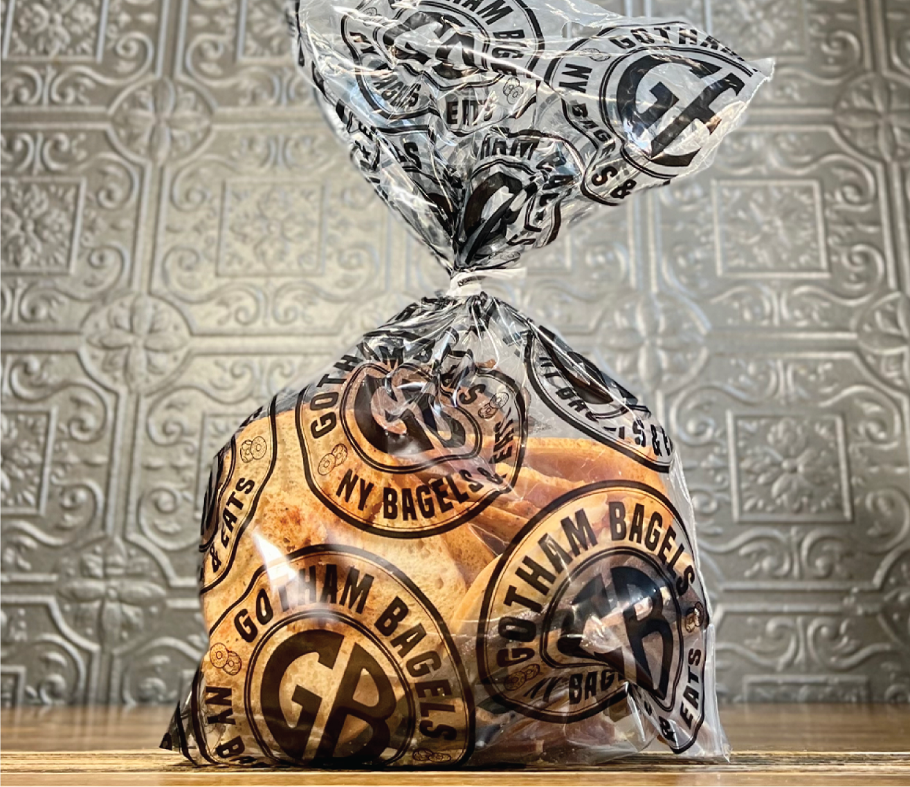
Inspired by the NYC subway medallions, the Gotham Bagels secondary logo was created to compliment the existing logo. The circle shape balances the rectangle shape of the existing logo. The token, as we all call it, is used across social media, packaging and merch design.


Natural Colors and Simple Vectors
Simple line art in white over a natural color palette let the bagels do the talking.