Sability Website Redesign
Sability, a premier UKG partner, needed help turning their website into a usable sales tool. In a sea of UKG implementation partners, Sability wanted to make sure they rose to the top.
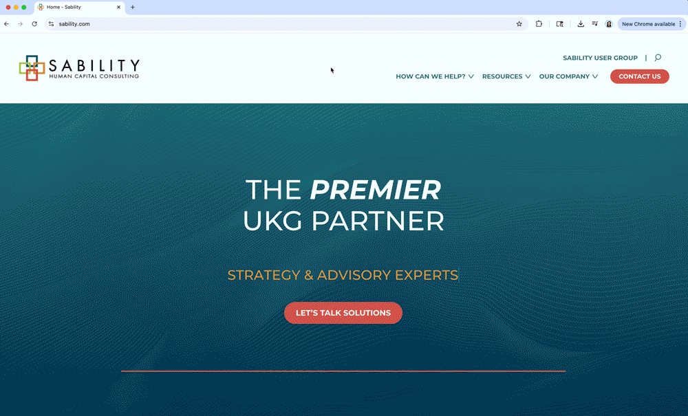
The Problem: The Sability website is outdated and not helpful as a sales tool.
The Solution: Expand the scope of the website and elevate with a polished and professional look.
Services: Website Design / Brand Refresh / Brand Guidelines
Work done on behalf of BatesMeron Sweet Design.
Art Direction & Design: Esmeralda Hopwood
Out with the old
Sability made it clear, they wanted a website that went beyond bulleted information. As it stood, the website was comprised of a few pages that relied heavily on lists. After conducting an audit with the BatesMeron developer, we discovered that the site relied heavily on anchor links that kept users on one page. While not incorrect, this made it so Sability’s pages were not scrolled regularly by Google and users got lost quickly trying to navigate from one service to the other.
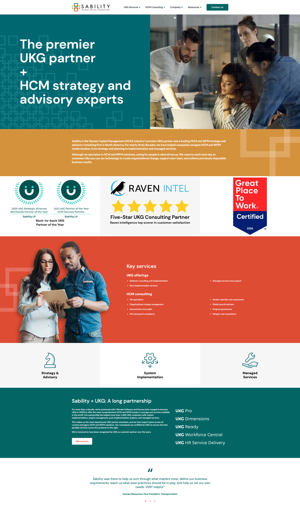
Organize & Expand
We streamlined the existing content, reorganized the flow and showed Sability the gaps left on their website.
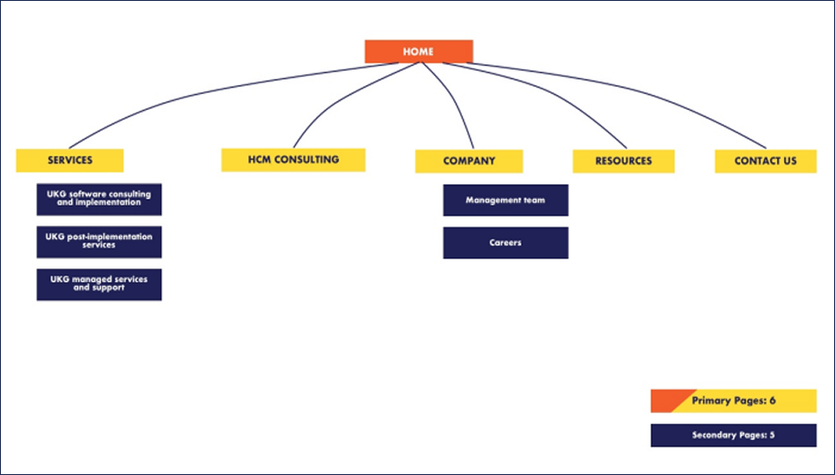
Our recommendation: Expand the website from 6 pages to 57.
Typically, we wouldn’t encourage a client to create a more dense website (more often than not its the opposite). But in Sability’s case, more is in fact more. In order to illustrate our point, we walked Sability through an updated site map that focused on clear messaging and organization.
Sability loved the new site map and took our recommendations to heart. While they worked on ensuring the services and information they wanted were highlighted, I got to work bringing an elevated look to their existing branding.
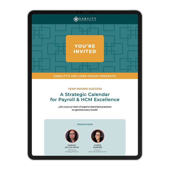

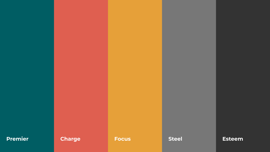
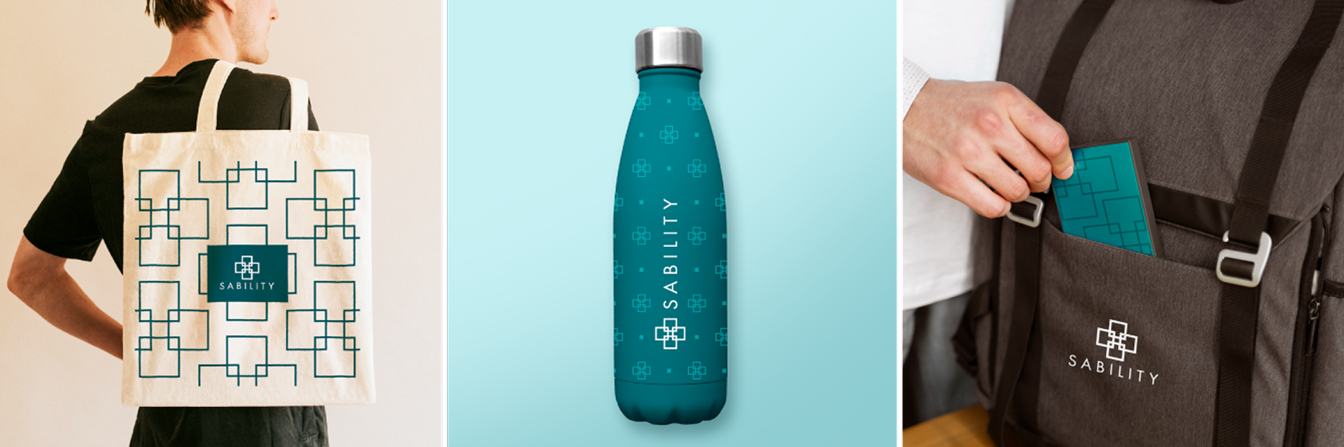
Sability wanted to portray themselves as a luxury brand with a laid back attitude.
In researching the competition, as well as luxury service brands and industries, I learned that restraint was a key factor in conveying premium quality. An updated palette, custom patterns and iconography tailored to Sability helped us achieve that look.


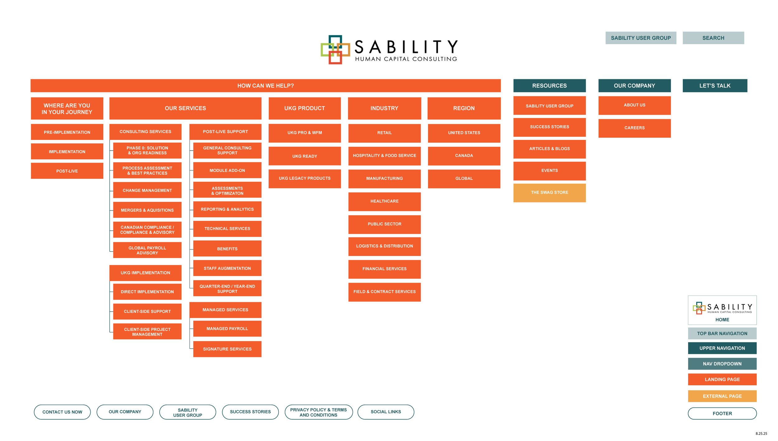
Navigation is Key
Once our site map and design direction were agreed upon, it was time to tackle the most important part of the website—the navigation. With such a dense site map, I proposed using a mega menu in order to create a clear path for users.
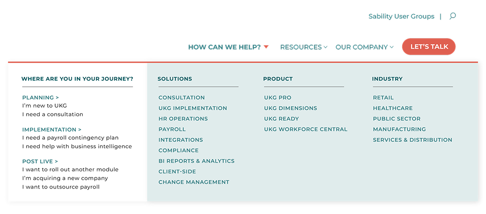
Option 1 used a straightforward mega menu design, with clear headers and a section specific to the customer journey.
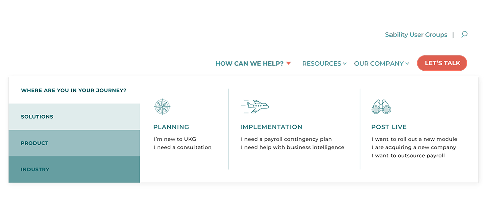
Option 2 broke the navigation into smaller chunks that used color and icons to help illustrate what each part was.
In the end, Sability took elements from both.