Ed Debevic’s Rebrand
Ed Debevic’s, Chicago’s most famous retro themed diner, was making a comeback after an 8 year hiatus. Famously known for its snarky service & 1950s throwback decor, Ed’s was looking to freshen up their look starting with an updated logo and refreshed branding.
The Problem: Ed’s needs a complete brand refresh with updated guidelines.
The Solution: A new logo, unified brand colors and comprehensive brand guidelines.
Services: Logo Creation, Branding, Print Design, Merch Design, Ongoing Marketing & Branding Support
First, the logo
Ed Debevic’s wanted an updated logo that would work well across digital and physical applications. The original logo was busy and lacked unity. However, the dinner plate serving as the container for the brand was interesting and so I got to work.
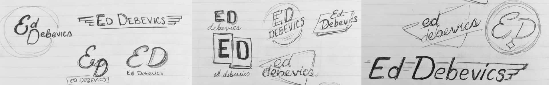
Based off my conversations with the Ed’s team, I knew they wanted something bold, modern but retro inspired and fun. I played with a variety of designs, many utilizing retro shapes and hand drawn typography that the Ed’s team loved.
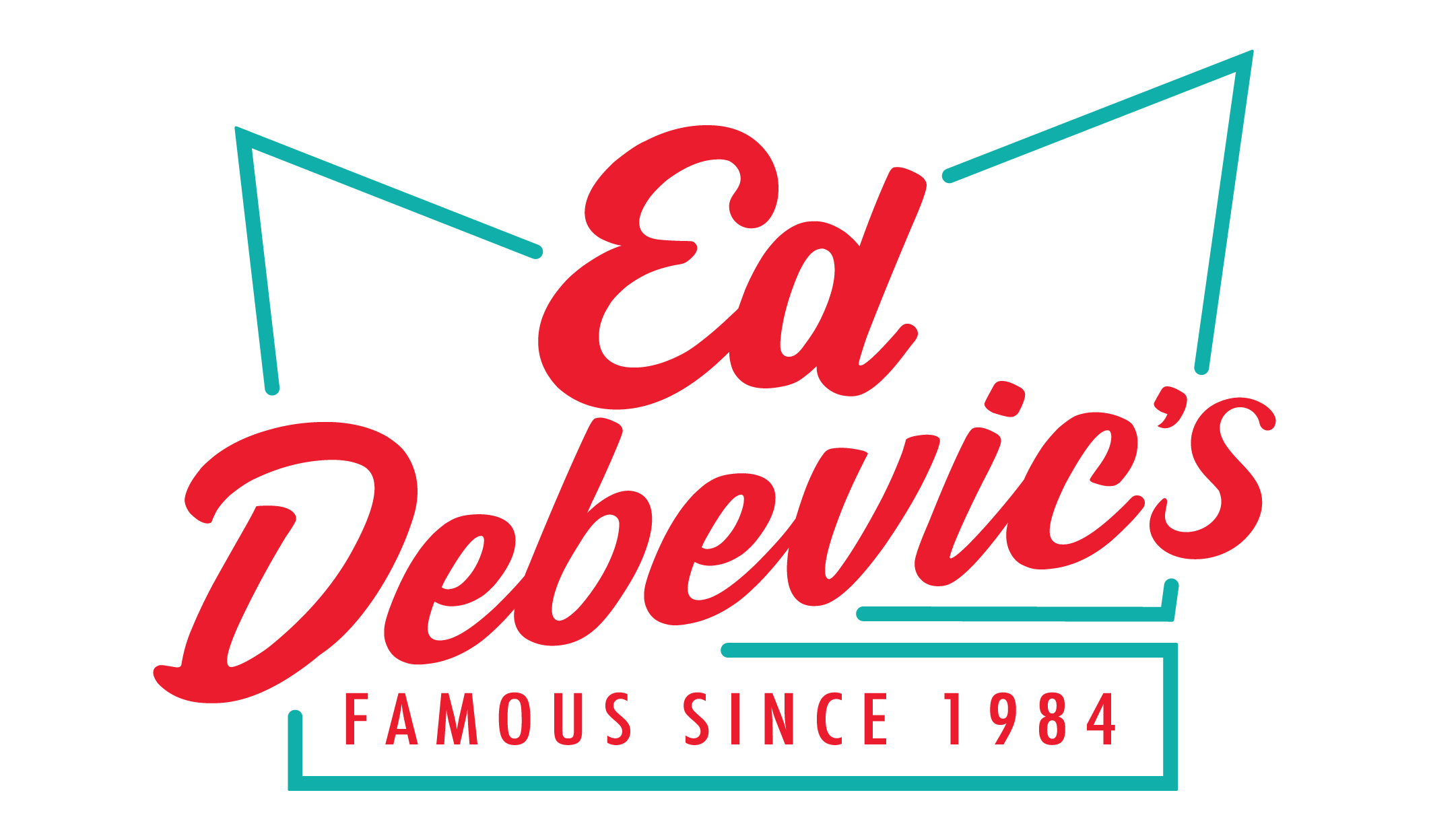
The chosen logo was modern and bold without sacrificing the retro vibes Ed’s wanted to keep at the forefront. The use of a soda jerk hat, still used in the restaurant today, ensured that anyone coming into contact with the Ed’s logo would know exactly what to expect.
An elevated retro diner experience.

Let’s get cookin’
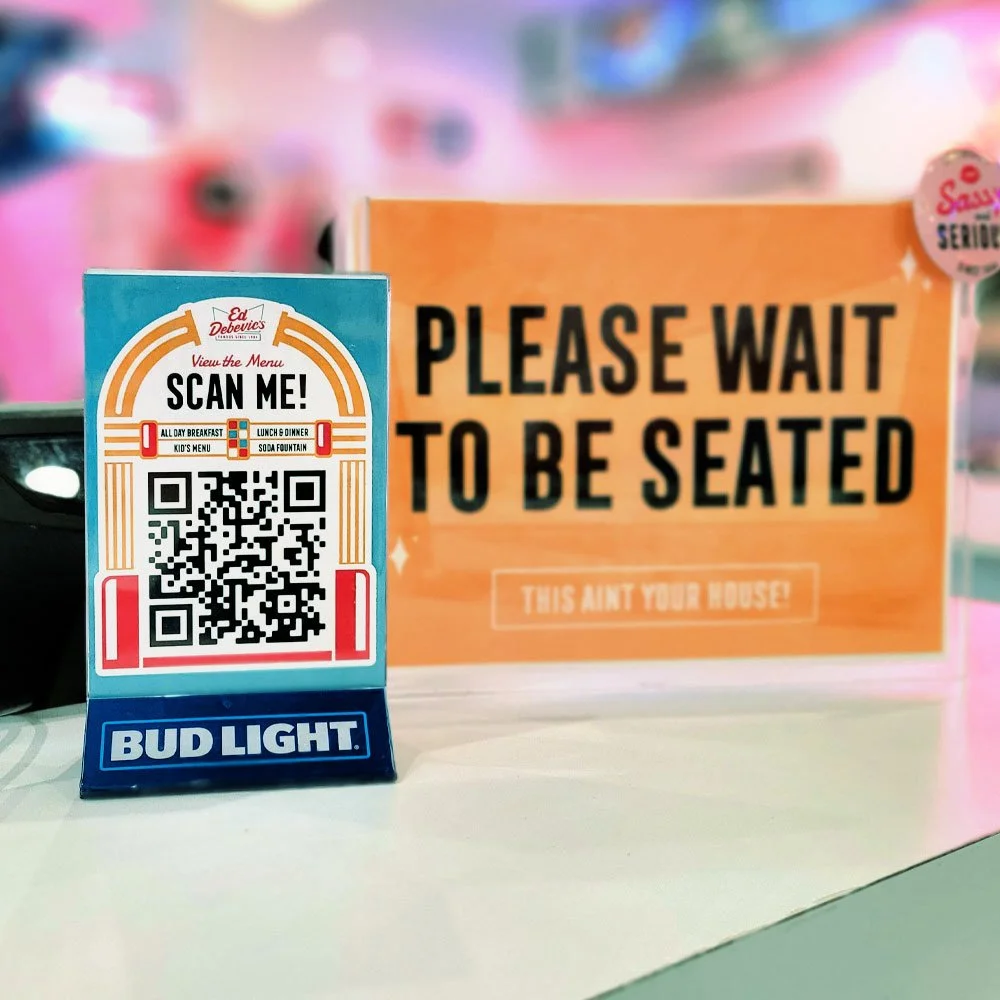
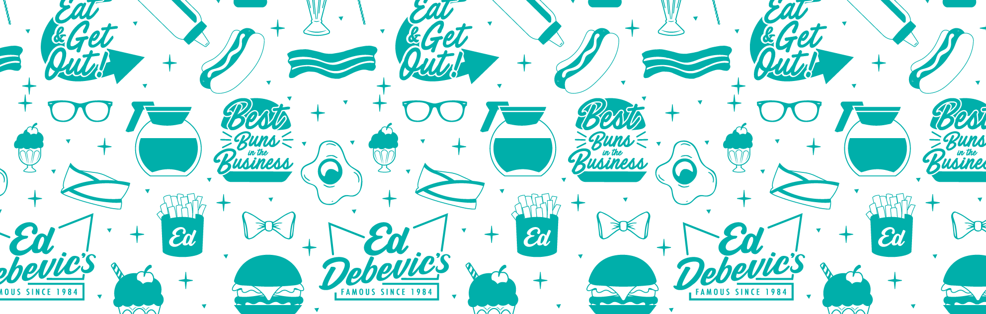
With the logo decided, it was time to get going on the rest of the brand. An updated color palette, custom pattern using hand-drawn elements, and visuals heavily inspired by 50’s & 60’s signage and neons, Ed’s was ready to fire up the grill.

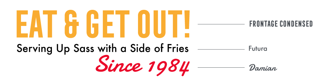
The use of Frontage Condensed allowed Ed’s to layer typography and easily achieve 3d & neon effects without the need to use a design program. The result? A quirky font treatment that could be pulled off by a designer (me) or a manager needing to print off a meal special while staying brand compliant.
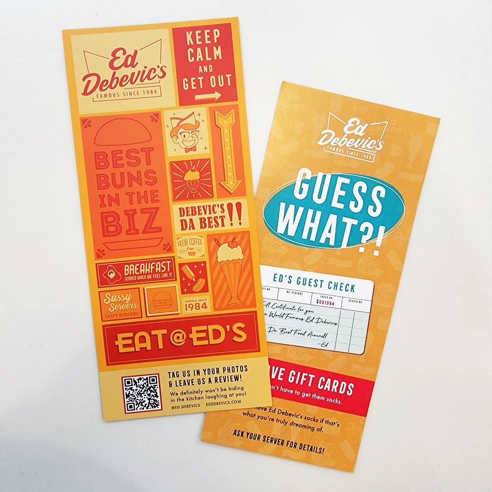
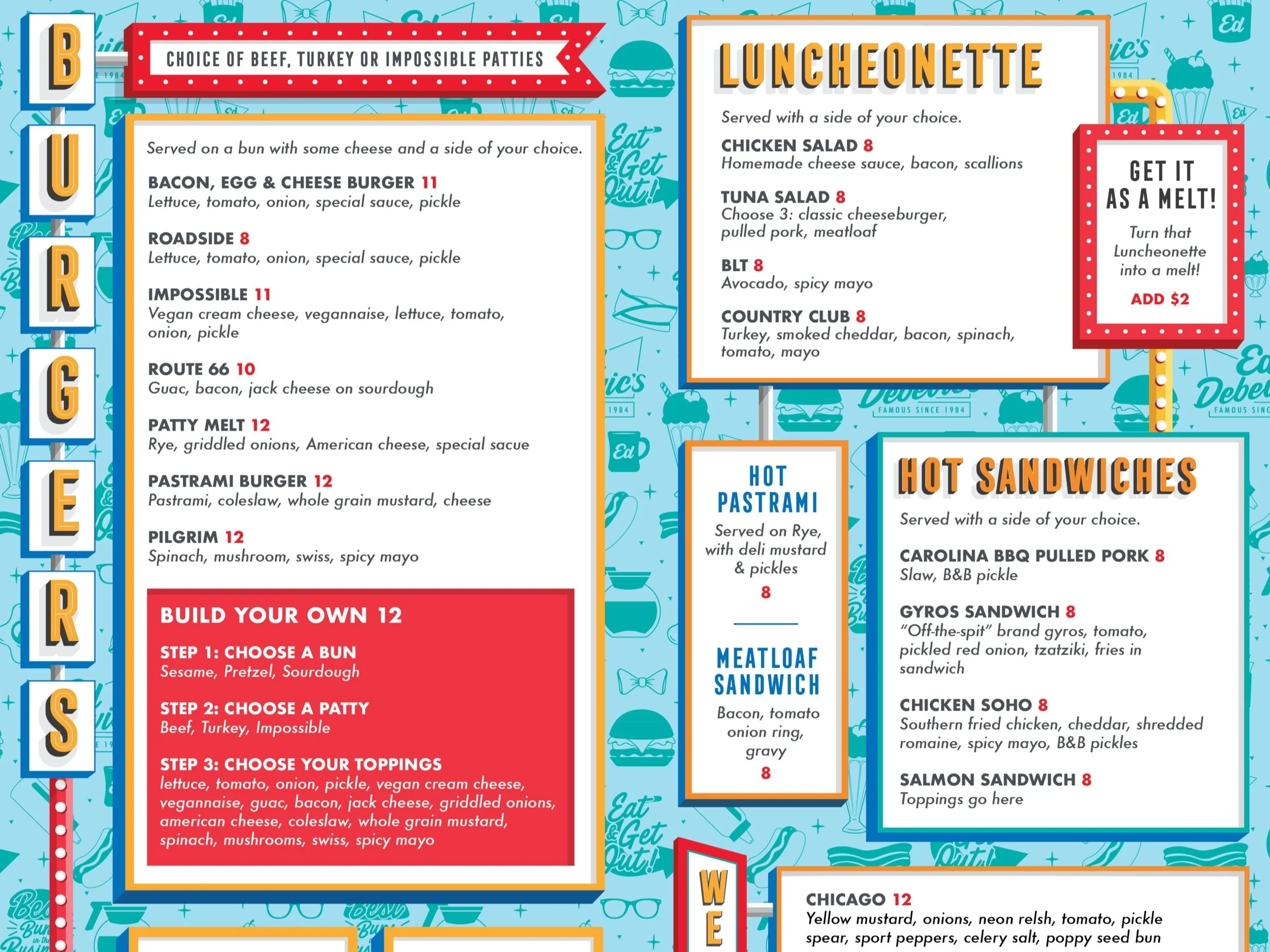
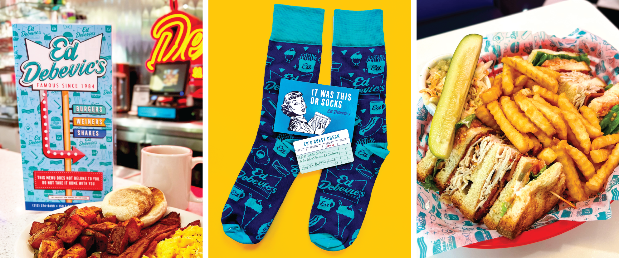
A custom Menu
For the menu, Ed’s wanted a less traditional approach. Taking inspiration from Drive Ins, I created a custom trifold menu with drive through style call outs and 3D typography. The menus were such a hit with customers, signage pleading for an end to menu theft was put in at the host stand. To hopefully put an end to this, I created a mini version of the menus that were easy to print in house and give to customers as a mini souvenir of their time at Ed’s.


Loved the branding work?
Make sure to check out the other projects I worked on for Ed Debevic’s!