Gino’s East In-House Design
Gino’s East is the largest restaurant in Bravo Restaurants' portfolio. As the In-House Art Director, I oversaw and executed all design needs. Working in deep dish in a city full of pizza comes with a variety of challenges and opportunities to appeal to both tourist and local audiences.
Services: Branding / Environmental / Strategy / Motion Graphics / CPG packaging / Merch / Print
Art Direction & Design: Esmeralda Hopwood Photography: Lili Kryzanek
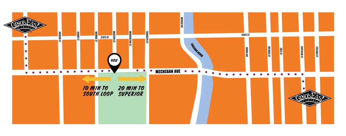
Bus Shelters on the Mag Mile
Working with the Director of Marketing, we launched two summer bus-shelter campaigns to attract more customers. These bus shelter ads were located on Wacker & Michigan and Madison & Michigan to help drive interest and traffic to the Chicago Gino’s East locations. Each ad included a small map with directions to the nearest Gino’s East.
The bus shelters were live for 2 months. From go-live to take-down, the Gino’s team reported increased foot traffic and online ordering. The South Loop location also saw an increase in lunch reservations from local businesses.


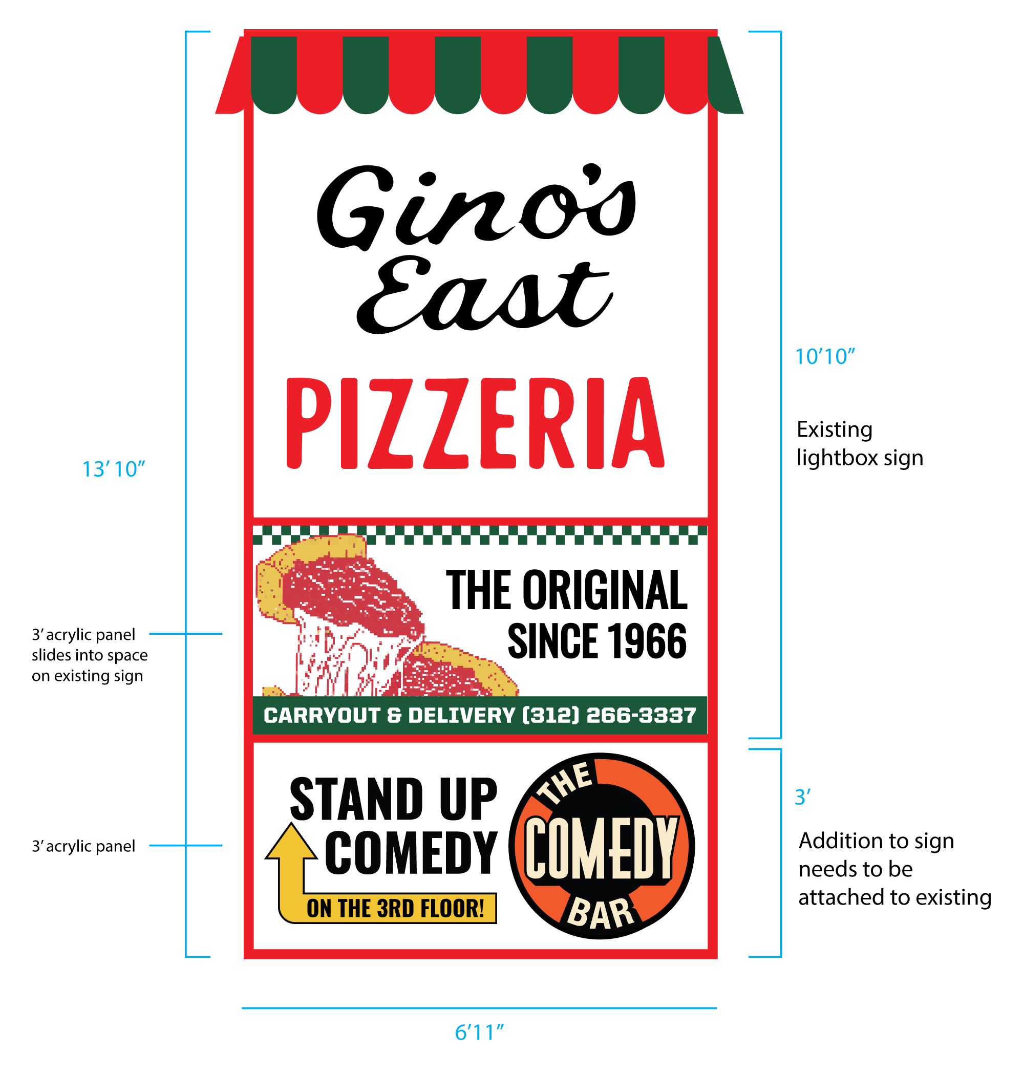
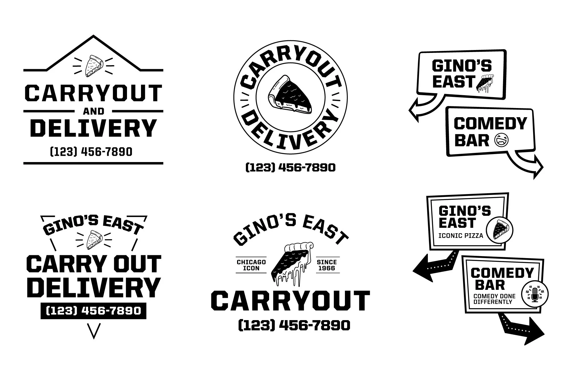
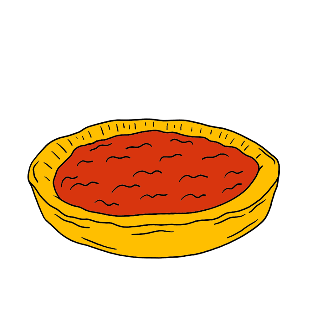
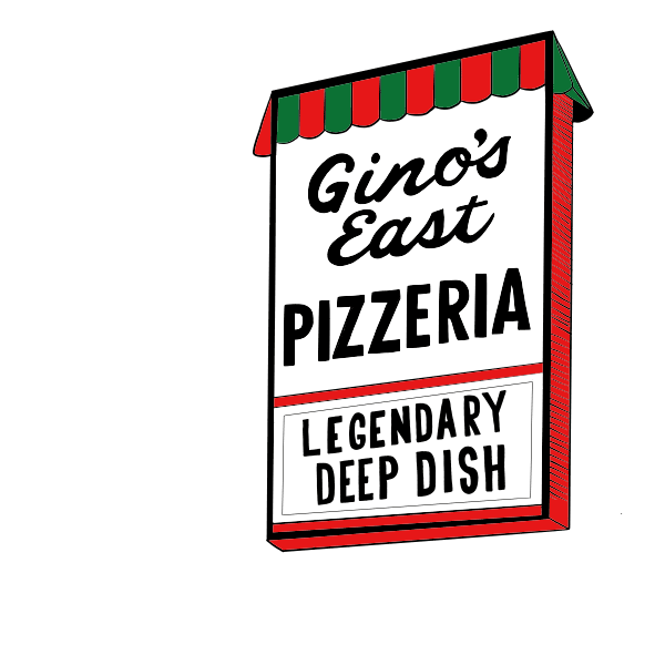
Exterior Signage


Gino’s East Instagram Stickers
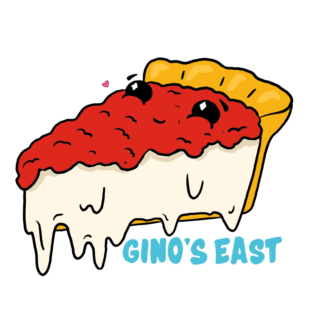
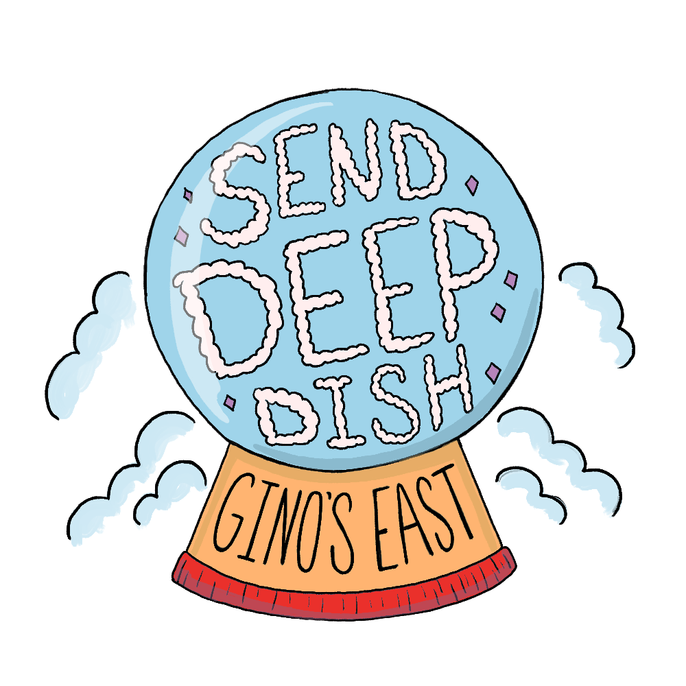
Gino’s East wanted illustrated and animated stickers to use across their social media accounts. To achieve this, I illustrated stickers and then brought them to life using frame animation.


Deep Dish Carton Redesign
In 2019, the Gino’s East Frozen Pizzas cartons underwent a major redesign. Three years later, we revisited the design in response to evolving customer interactions.
The Problem: Gino’s East wanted to focus on a natural-looking box with a greater emphasis on color than the previous boxes.
The Solution: An updated box with a natural carton look, bold typography that more closely aligned with Gino’s East as a brand, and an emphasis on the Gino’s East story.
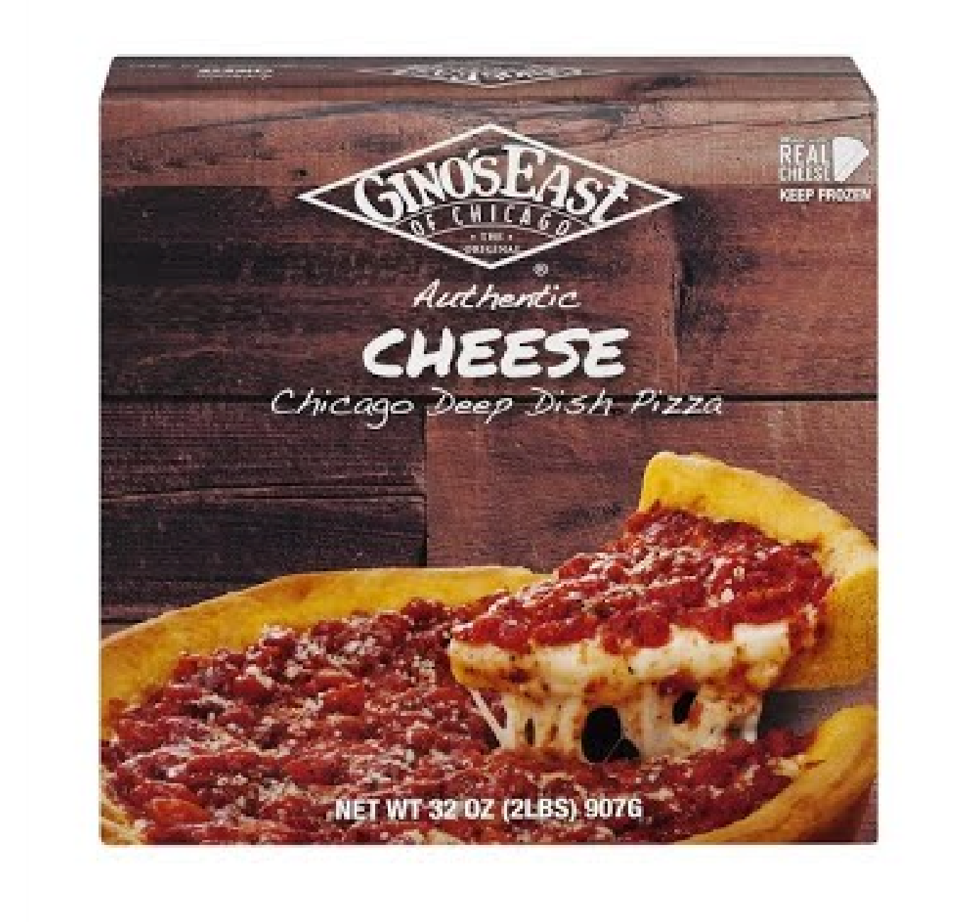
Gino’s East Deep Dish Cartons
Original Packaging 2017
Gino’s East Deep Dish Cartons
Updated Packaging 2019
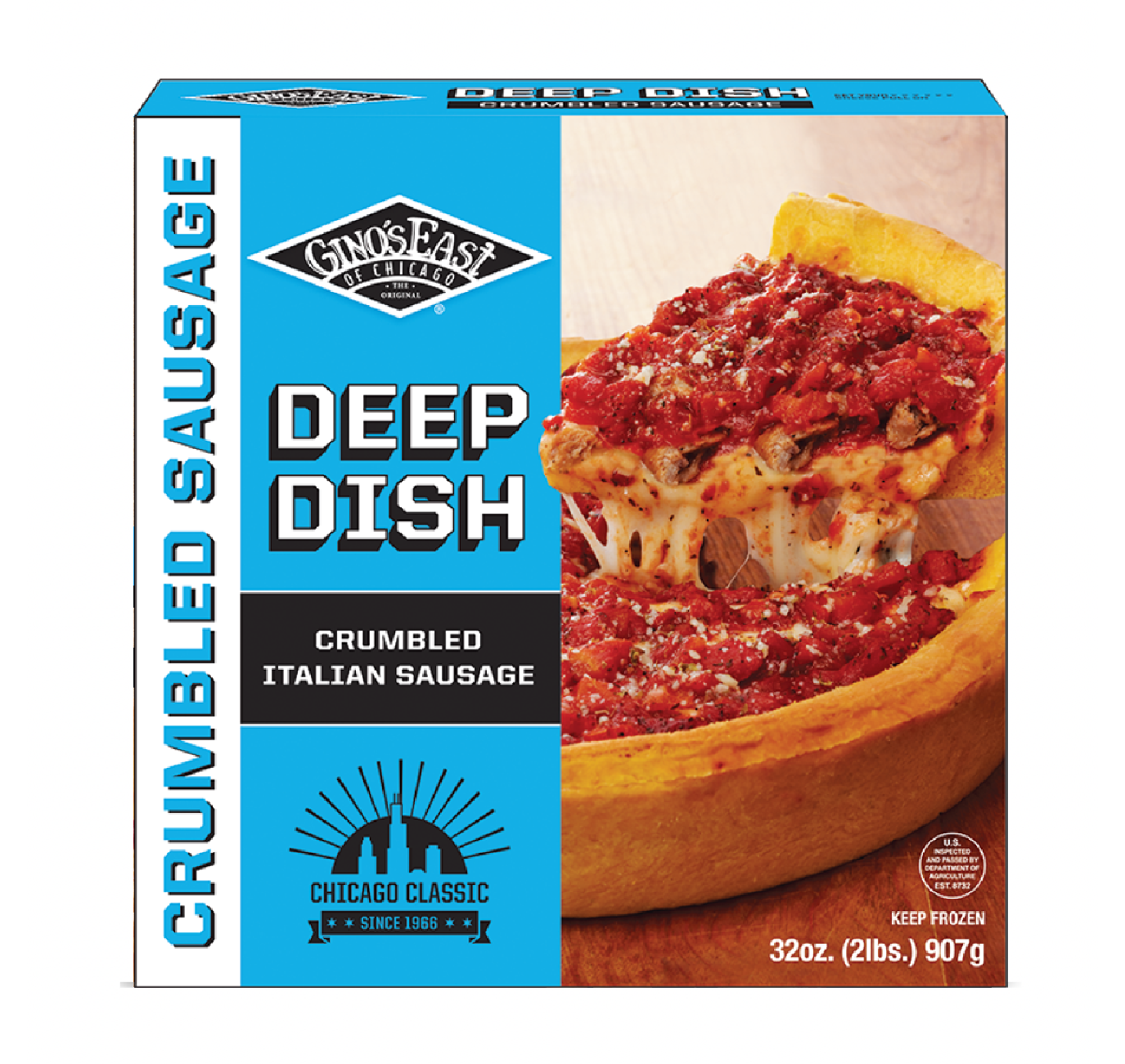
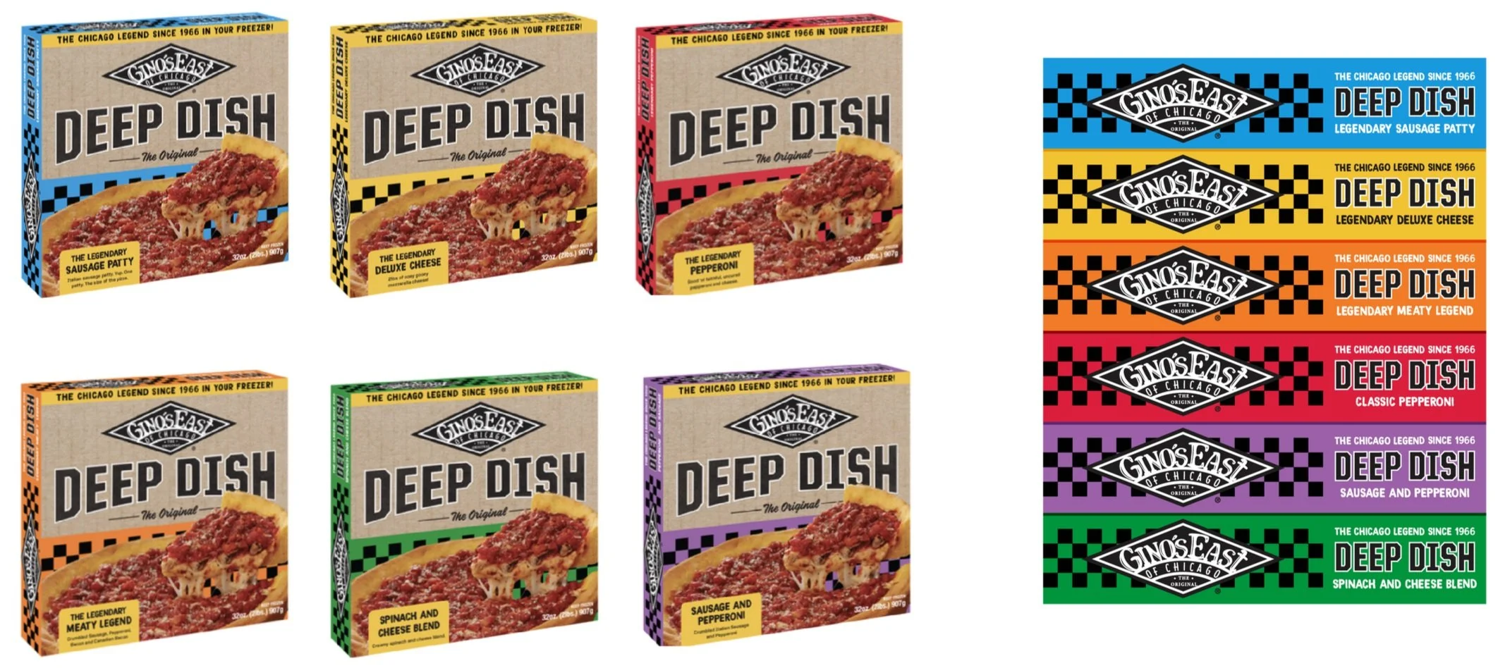
The 2019 update to the Deep Dish cartons focused on bold simplification, using a color-blocking system to support customer self-selection. Each pizza flavor was assigned a unique color to help customers easily locate the one they wanted. The updated design led to a surge in flavor selection, allowing the brand to expand into more freezer sections. This also paved the way for updated Tavern-Style cartons and the addition of more flavors.
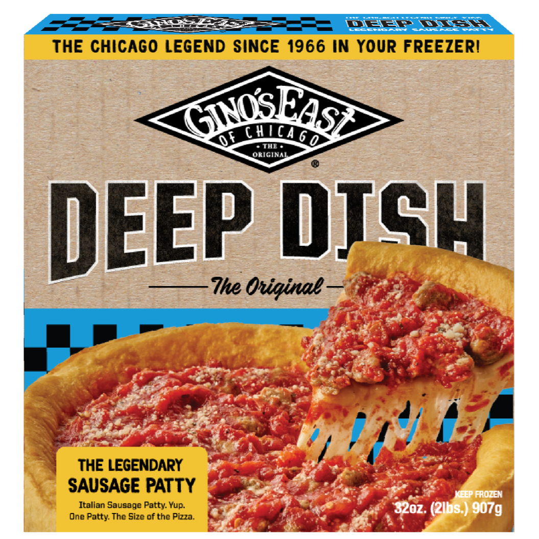
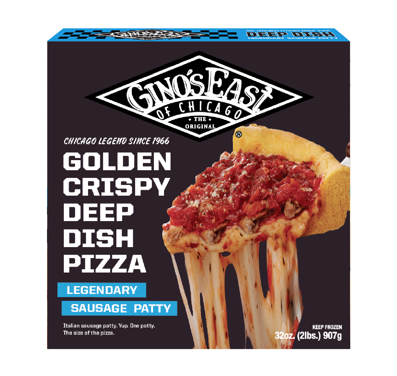
New concepts for 2024
After 4 years, Gino’s East conducted an in-depth analysis and found room for improvement. Research showed customers responded to bold colors, but the size of the cartons, and the way they were stacked in the freezer section, made it difficult to find.
Concept one utilized the texture of cardboard paired with the same bold colors consumers had grown accustomed to. Simplified typography, larger-than-life logo placement, and pops of color freshened the look without losing the color-coded nature of the 2019 cartons.
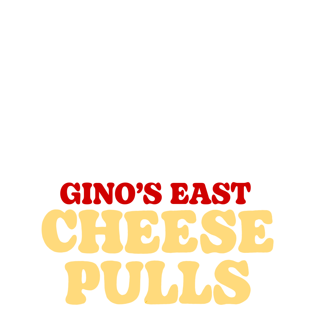
Concept two took a different approach with a dark background and a focus on the legendary cheese pull. Large and crisp typography describes exactly why you should buy this deep dish and forget about the rest.
After much back and forth, the Gino’s team agreed: concept one would have broader mass appeal while still standing out from the rows and rows of competitor pizzas.
Love the work?

